
Within the world of outdoor gear, few visual identities are as recognizable as the Patagonia logo. A simple mountain silhouette stretching across a horizon might seem minimal at first glance, yet it carries decades of philosophy, environmental activism, and outdoor culture.
The Patagonia logo is not a decorative mark created for trend-driven branding. It reflects the origins of a company built by climbers, surfers, and environmentalists. Understanding the logo means understanding the landscape that inspired it and the values that shaped the company behind it.
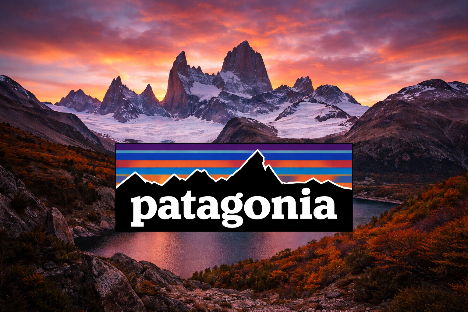
The Patagonia logo features a stylized silhouette of jagged mountains against a colorful twilight sky. The skyline represents Mount Fitz Roy, a dramatic peak located in the Patagonia region of South America.
The logo usually appears as:
- A black mountain silhouette
- A horizontal skyline of peaks
- A gradient sunset background in purple, blue, and orange tones
- The word Patagonia in bold uppercase letters above the mountains
While the design is visually simple, the scene captures a very specific moment: the fading light behind a legendary mountain that climbers admire around the world.
Unlike many fashion brands that frequently refresh their logos, Patagonia has kept this design largely unchanged for decades. That consistency is intentional. It reinforces the company’s long-term identity as an outdoor brand rooted in wilderness culture.
The Origin of the Patagonia Logo
The story of the logo begins with Yvon Chouinard, a climber and environmentalist who founded the company in 1973.
Chouinard and his friends spent years climbing in the remote mountain regions of southern Argentina and Chile. Among those peaks, Mount Fitz Roy stood out as one of the most dramatic and technically challenging climbs in the world.
Rather than inventing an abstract logo, Patagonia chose to represent that real mountain.
The design was created to capture the silhouette of Fitz Roy at sunset, a moment many climbers remember vividly. The fading colors symbolize the end of a long day in the mountains—a familiar scene for anyone who has spent time outdoors.
In that sense, the logo works less like a corporate symbol and more like a memory.
Why Mount Fitz Roy Matters
Mount Fitz Roy sits in the Andes near the border between Argentina and Chile. The peak rises sharply with steep granite faces that attract climbers from around the globe.
For the early Patagonia team, Fitz Roy represented:
- Exploration
- Physical challenge
- Wild, untouched landscapes
- The spirit of climbing culture
The mountain is difficult to climb not only because of its steep rock but also because of unpredictable weather patterns. Strong winds and sudden storms make it one of the more intimidating peaks in the climbing world.
Using Fitz Roy in the logo quietly signals that the brand comes from authentic outdoor experience rather than marketing-driven imagery.
Many outdoor enthusiasts recognize the mountain immediately, which strengthens the connection between the logo and the climbing community.
The Meaning Behind the Patagonia Logo
The Patagonia logo communicates several ideas without relying on complex symbolism.
Connection to Nature
At its core, the logo represents wilderness. Mountains are one of the clearest symbols of wild landscapes, and the silhouette reflects Patagonia’s deep relationship with nature.
Authentic Outdoor Heritage
Because the image is based on a real mountain known among climbers, it reinforces the company’s credibility in the outdoor world.
This subtle authenticity is one reason Patagonia has maintained strong trust among serious outdoor enthusiasts.
Simplicity Over Trend
The design is not flashy or complicated. There are no elaborate graphics or modern minimalistic redesigns.
Instead, the logo remains stable and recognizable—much like the brand’s long-standing philosophy.
Environmental Responsibility
Patagonia is widely known for its environmental activism. While the logo itself doesn’t explicitly mention sustainability, the mountain landscape quietly reflects the natural world the company aims to protect.
The symbol becomes more meaningful when viewed alongside Patagonia’s environmental campaigns and conservation efforts.
Evolution of the Patagonia Logo
Unlike many global brands that regularly update their visual identity, the Patagonia logo has changed very little since its introduction.
The basic elements—mountain silhouette, gradient sky, and brand name—have stayed consistent.
There have been minor variations depending on where the logo appears:
- Full-color logo used on labels and marketing materials
- Single-color versions used on gear and apparel
- Simplified black or white versions for embroidery
These variations are practical rather than stylistic. They allow the logo to work across jackets, backpacks, hats, and product tags.
The core design remains intact.
This level of consistency has helped Patagonia maintain one of the most recognizable logos in outdoor apparel.
Why the Logo Works So Well
Strong logos tend to share a few characteristics: simplicity, meaning, and memorability. Patagonia’s design checks all three boxes.
It Tells a Story
Many logos rely on abstract shapes that require explanation. Patagonia’s logo immediately evokes a place and an experience.
People can imagine standing in front of that mountain range at sunset.
It Reflects the Brand’s Culture
The company grew out of climbing culture, not fashion design. The mountain silhouette reflects that origin naturally.
There is no gap between the logo and the brand story.
It’s Easy to Recognize
Even without the brand name, the skyline silhouette has become recognizable to outdoor enthusiasts.
This visual recognition is particularly powerful on clothing and gear.
It Avoids Trend Cycles
Some logos feel dated after a few years because they follow design trends.
The Patagonia logo avoids this problem by relying on a timeless natural image rather than a fashionable graphic style.
The Logo on Patagonia Products
One interesting aspect of the Patagonia logo is how subtly it appears on products.
Many Patagonia jackets, fleeces, and backpacks feature a small woven tag rather than a large printed logo. This understated approach fits the brand’s personality.
The logo typically appears on:
- Jacket chest labels
- Backpack patches
- Hat tags
- Product packaging
- Retail signage
Unlike many fashion brands that emphasize large logos, Patagonia often keeps its branding discreet. For many customers, the quality of the gear matters more than the visibility of the brand name.
Patagonia Logo and Environmental Messaging
Over time, the Patagonia logo has become closely associated with environmental advocacy.
The company has funded conservation initiatives, donated profits to environmental causes, and publicly supported climate action.
Because the logo represents a real mountain landscape, it naturally aligns with those efforts.
The symbol quietly reinforces the message: these wild places are worth protecting.
When customers see the logo, they often associate it not just with outdoor gear but also with responsible environmental practices.
Cultural Impact of the Patagonia Logo
In recent years, Patagonia’s logo has moved beyond the outdoor community and into mainstream fashion and culture.
Several factors contributed to this shift:
- Growing interest in sustainable brands
- Increased awareness of environmental issues
- The popularity of functional outdoor clothing in everyday wear
Despite this broader appeal, the logo has largely retained its original meaning.
It still signals adventure, exploration, and respect for nature.
For many people, wearing the logo represents a set of values rather than simply a clothing choice.
Why Patagonia Never Rebranded the Logo
Many companies eventually redesign their logos to appear more modern. Patagonia has resisted that pressure.
There are practical reasons behind this decision.
First, the existing logo already carries strong recognition. Changing it would risk weakening that connection.
Second, Patagonia’s brand philosophy emphasizes durability and long-term thinking. Constant redesigns would contradict that mindset.
Keeping the same logo reflects the same principle the company applies to its products: build something well and let it last.
FAQ: Patagonia Logo
What mountain is shown in the Patagonia logo?
The logo features the silhouette of Mount Fitz Roy, a dramatic peak located in the Patagonia region of Argentina and Chile. It’s a well-known destination among climbers and mountaineers.
Who designed the Patagonia logo?
The logo was created during the early years of the company founded by Yvon Chouinard. The design was inspired by his climbing experiences in the Patagonia region.
What do the colors in the Patagonia logo represent?
The gradient colors represent a sunset behind the mountains. It reflects the end of a day outdoors, something climbers and hikers often experience in remote landscapes.
Has the Patagonia logo ever changed?
The core design has remained mostly unchanged since the company’s early years. Only small adjustments have been made to adapt the logo for different products and materials.
Why is the Patagonia logo so recognizable?
Its simplicity plays a major role. The distinctive mountain skyline and bold typography make it easy to identify even when the logo appears small on clothing or gear.
Does the Patagonia logo represent environmental values?
Indirectly, yes. While the logo itself shows a mountain landscape, it has become closely associated with Patagonia’s environmental activism and conservation efforts.
The Patagonia logo demonstrates how a simple design can carry deep meaning when it grows from real experience. Instead of abstract branding, it reflects a specific place, a culture of exploration, and a long-standing respect for the natural world. Over time, that authenticity has turned a small mountain silhouette into one of the most recognizable symbols in outdoor gear.