
The barchart is one of the most widely used tools for presenting data visually. Whether you are looking at sales numbers, website traffic, or financial market movements, a bar chart offers a straightforward way to compare values across categories.
People encounter bar charts in many places: school textbooks, business reports, news articles, and financial platforms. The reason is simple. A barchart turns rows of numbers into something the human brain can understand quickly.
Instead of scanning tables, readers can instantly see which category is higher, lower, or changing over time. That clarity is what makes the barchart such a reliable visualization method.
What Is a Barchart?
A barchart, also called a bar chart, is a graphical representation of data using rectangular bars. Each bar corresponds to a specific category, and the length or height of the bar represents the value associated with that category.
The basic idea is simple: longer bars represent larger values, and shorter bars represent smaller ones.
A typical barchart contains three main elements:
- Categories – the items being compared
- Values – the numerical data associated with each category
- Axes – the horizontal and vertical reference lines that organize the data
For example, a company might create a bar chart showing monthly sales:
| Month | Sales |
|---|---|
| January | $20,000 |
| February | $28,000 |
| March | $25,000 |
In a barchart, February’s bar would be the tallest because its value is highest.
Why Barcharts Are So Widely Used
Bar charts remain popular because they communicate information quickly without requiring specialized knowledge.
Several practical advantages explain their widespread use.
Easy Comparison
A barchart allows readers to compare multiple categories at a glance. If five products are displayed on a chart, it becomes immediately clear which one sells the most.
Tables require mental calculation. A chart removes that effort.
Simple Structure
The format is easy to understand. Even people with little experience reading graphs can interpret a bar chart correctly.
This simplicity makes barcharts common in education and journalism.
Flexible Applications
Bar charts work well across many types of data:
- Business performance
- Population statistics
- Marketing analytics
- Sports statistics
- Scientific research
Whenever discrete categories need comparison, a barchart becomes a practical option.
Types of Barcharts
Although the core concept remains the same, bar charts appear in several variations depending on how the data needs to be presented.
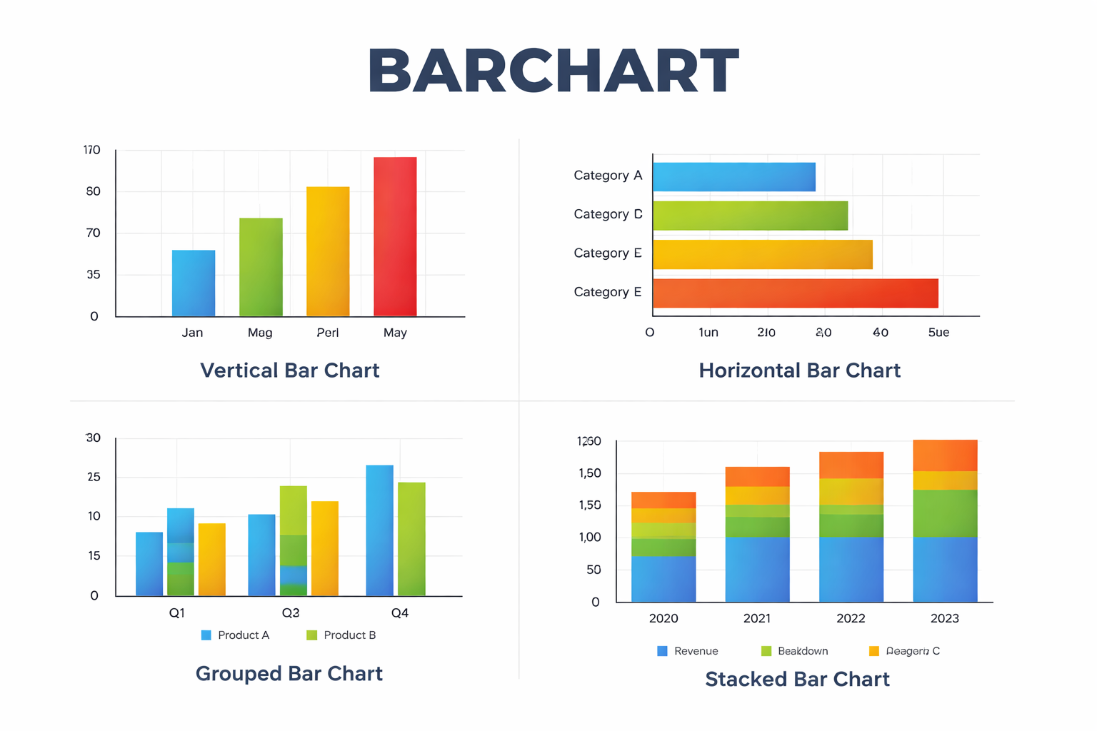
Vertical Bar Chart
The most common format uses vertical bars rising upward from the horizontal axis.
Categories appear along the bottom, while numerical values run along the vertical axis.
Example uses:
- Monthly sales figures
- Survey results
- Product comparisons
Vertical charts are often used when the categories represent time periods.
Horizontal Bar Chart
A horizontal barchart flips the orientation. Bars extend from left to right rather than upward.
This format becomes helpful when category labels are long or when there are many items to compare.
Common examples include:
- Ranking lists
- Survey responses
- Demographic comparisons
Many analysts prefer horizontal charts when readability matters.
Grouped Bar Chart
A grouped bar chart places multiple bars side-by-side within each category.
This structure allows comparison across two dimensions.
For instance, a company might compare sales for two products across several months:
| Month | Product A | Product B |
|---|---|---|
| January | 20 | 18 |
| February | 24 | 22 |
| March | 21 | 26 |
Each month would show two adjacent bars, making differences easy to spot.
Stacked Bar Chart
A stacked barchart divides each bar into segments representing parts of a total.
This helps visualize composition as well as overall size.
Example:
A company might show total revenue broken down by region:
- North America
- Europe
- Asia
Each bar represents total revenue for a year, while segments show the contribution of each region.
Stacked charts work best when there are only a few segments; otherwise they become difficult to read.
Key Components of a Barchart
Even a simple chart relies on several elements working together.
Understanding these components helps avoid misinterpretation.
Axes
Bar charts typically use two axes:
- X-axis for categories
- Y-axis for numerical values
The axes provide context and measurement.
Bars
The bars themselves represent the magnitude of each value. Consistent width and spacing ensure that comparisons remain accurate.
Labels
Clear labels prevent confusion. A chart should identify:
- Categories
- Units of measurement
- Time period (if relevant)
Without proper labeling, a chart can easily mislead readers.
Scale
The numerical scale determines how values are displayed.
For example, if the scale jumps from 0 to 100 immediately, smaller differences may disappear visually. A carefully chosen scale helps the reader interpret changes correctly.
Real-World Uses of Barcharts
Bar charts appear in nearly every field that deals with structured data.
Some examples illustrate how versatile they are.
Business and Finance
Companies rely heavily on barcharts to visualize performance indicators.
Common uses include:
- Revenue by product category
- Customer acquisition by marketing channel
- Quarterly profit comparisons
Managers can quickly see which segments are improving and which require attention.
Education
Teachers often introduce bar charts early in mathematics classes because they help students connect numbers with visual patterns.
Students might use barcharts to represent:
- Favorite school subjects
- Daily temperature readings
- Survey responses from classmates
The format encourages basic statistical thinking.
Public Policy and Government
Governments frequently publish bar charts when presenting statistical information.
Examples include:
- Employment rates by region
- Population growth over time
- Energy production by source
These charts help citizens and policymakers understand complex datasets quickly.
Sports Analytics
Sports media often relies on bar charts to compare players or teams.
Examples might include:
- Goals scored per season
- Average points per game
- Win percentages across leagues
Fans can immediately identify standout performers.
When a Barchart Works Best
Not every dataset benefits from a bar chart. Choosing the right visualization matters.
Bar charts perform best when:
- Data consists of distinct categories
- The goal is comparison
- Values are not continuous measurements
For instance, comparing five smartphone brands works well in a bar chart.
However, showing stock prices minute by minute would usually require a line chart instead.
Understanding this distinction prevents charts from becoming misleading.
Common Mistakes in Barchart Design
Even a familiar visualization can cause confusion if designed poorly.
Several issues appear frequently.
Inconsistent Scales
If the vertical axis begins at a number other than zero, the visual difference between bars may become exaggerated.
Readers should always check the scale before drawing conclusions.
Too Many Categories
When dozens of categories appear in one chart, the bars become crowded and hard to read.
In those cases, a filtered dataset or multiple smaller charts often works better.
Overuse of Colors
Color can help distinguish groups, but excessive color variation makes charts visually noisy.
A restrained palette usually communicates the data more clearly.
Barcharts in Digital Tools
Modern software has made creating bar charts easier than ever.
Many everyday tools support them:
- Spreadsheet applications
- Data visualization platforms
- Business intelligence dashboards
- Financial analysis software
These platforms automatically generate charts from datasets, allowing users to focus on interpreting results rather than drawing graphics manually.
Despite the automation, thoughtful design still matters. The software cannot decide whether the chart tells a meaningful story.
How Barcharts Help Decision-Making
Good visualizations reduce cognitive effort. Instead of interpreting raw numbers, decision-makers can see patterns immediately.
For example, a marketing manager reviewing campaign results might notice that one advertising channel consistently outperforms others. A quick glance at a bar chart could reveal that insight faster than reading a spreadsheet.
This ability to reveal patterns quickly is why bar charts remain a standard tool in reports and presentations.
FAQ: Barchart
What is the difference between a barchart and a bar graph?
The terms are usually interchangeable. Both describe charts that use rectangular bars to represent data values. Some academic texts prefer “bar graph,” but the structure is identical.
When should you use a barchart instead of a line chart?
A barchart works best for comparing separate categories, such as products or regions. Line charts are more suitable when tracking continuous changes over time.
Can a barchart show negative values?
Yes. Bars representing negative values extend below the horizontal axis. This is common in financial charts that display profits and losses.
How many categories should a bar chart include?
There is no strict limit, but readability declines once a chart contains more than about ten categories. At that point, grouping or filtering usually improves clarity.
Why do some bar charts start above zero?
Sometimes designers adjust the axis to emphasize small differences. While this can highlight trends, it can also exaggerate variation, so readers should check the scale carefully.
Bar charts have remained relevant for centuries because they align with how people process visual information. A simple rectangle rising higher than another communicates a message faster than a table of numbers ever could.In a world where data keeps expanding, that simplicity still carries real value.